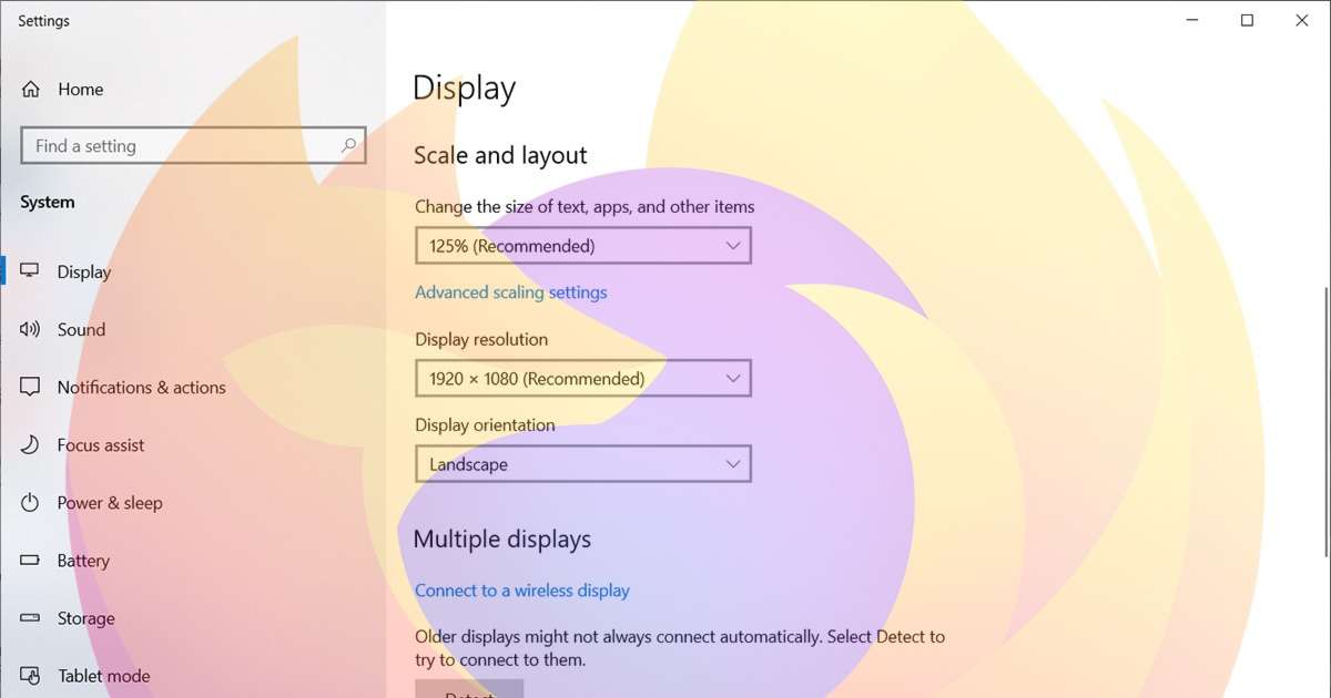

While discussing MaterializeCSS with Andrei the other day, he mentioned a very unique bug with media queries not working at exactly the responsive breakpoints. We checked this on various browsers and devices. It seems to only affect Mozilla Firefox on Windows 10 with Display Scaling other than 100% (my display is at 125%.)
We soon realized that this wasn’t a MaterializeCSS specific issue. In 2016, a very similar issue has been referenced and (sort of) fixed by Bootstrap. A related issue was also referenced by Ambyjkl on StackOverflow.
The issue
If you use CSS media queries, with a mix of max-width and min-width, you run into issues on the breakpoints. For example, we have
@media only screen and (min-width: 601px) {
  .mobile-menu {
    display: none;
  }
}
@media only screen and (max-width: 600px) {
  .desktop-menu {
    display: none;
  }
}
Now, this usually works fine. The mobile menu is hidden on screens that are 601 pixels or larger. The desktop menu is hidden on screens that are 600 pixels or smaller.
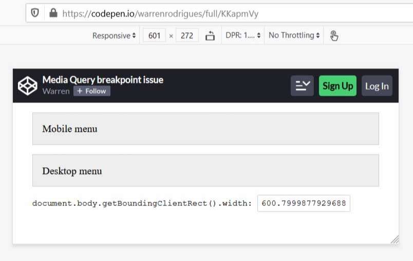
However, when the Display Scaling is not 100%, pixels fractions get involved. So we now have sizes between 600.00 and 601.00. Here’s a screenshot of a Codepen at 600, 601 and 602 pixels.
 Screenshot of CSS breakpoint at 600px.
 Screenshot of things breaking at 601px.
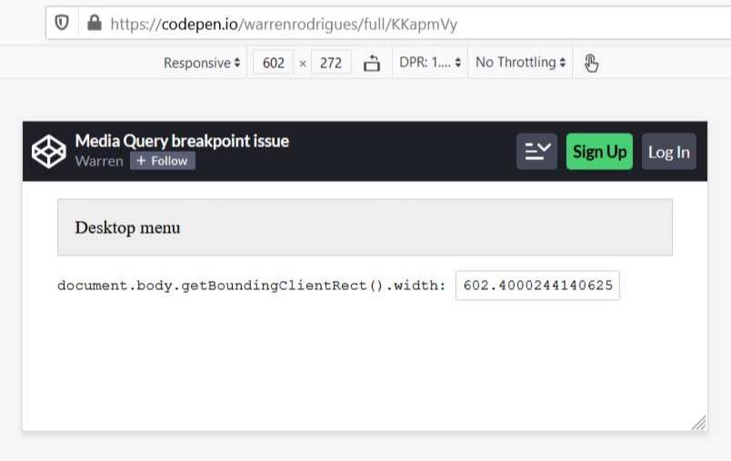 Screenshot of everything back to normal at 602px.
You'll see that things break at 601 pixels; and both menus are displayed. This happens because the width is actually 600.79 pixels. The mobile menu is not hidden, because the width is not yet 601 pixels. And the desktop menu is not hidden because the width is not 600 or smaller.
You can test this yourself by opening any website and typing this into the Developer Tools Console
document.body.getBoundingClientRect().width
The solutions
There are two possible solutions that we can use in CSS.
- Use integers for min-width and .99 fraction for max-width. The previous block of code would change to
@media only screen and (min-width: 601px) { .mobile-menu { display: none; } } @media only screen and (max-width: 600.99px) { .desktop-menu { display: none; } } - Stick to either max-width or min-width. Do not use a mix of the two. This way you can avoid dealing with the 0.99 pixels. This is my preferred solution, whenever possible.
If you're using a CSS framework like MaterializeCSS, you’ll need to edit some code and rebuild the CSS files. I have created a fork and committed the required changes to MaterializeCSS, using solution 1 above.
Further notes
A more verbose solution is available in Media Queries Level 4. The above code could change to
@media only screen and (width >= 601px) {
  .mobile-menu {
    display: none;
  }
}
@media only screen and (width < 601px) {
  .desktop-menu {
    display: none;
  }
}
Currently, support for Level 4 is minimal, so I wouldn't recommend using this solution right now.